I have been quite busy with scrappy things! I printed some more photos and BAM instant inspiration... just having new photos in my hand. I decided to take the time to bring each photo into Photoshop CS2 and get them printed in the sizes I needed them. I created a 8x10 canvas and dragged my photos into it... then I color corrected them and cropped them. When I picked them up from the printer all I needed to do was cut them apart. It was a huge time-saver in the end. I also found it's much cheaper this way, too. Anyways... I have posted my new layouts to the scrapbooking gallery at Two Peas (see link on the right column) but wanted to share a few with everyone here.

This first one (above) was a challenge for me because I had so many photos I wanted to include... but I forced myself to keep it to one page only (I'm not a fan of 2-page spreads because I hate having to do two pages with the same papers, etc... I guess I'm just too ADD-like to focus on two pages). Another challenge was the colors. The yellow swing, blue jeans, brown mulch, green trees, faded red... it's not that there were too many colors it's just that I don't have many papers in these tones. I went deep into my reserves and found this old Basic Grey plaid paper... it was perfect. Then I decided to make blue a focus and the back side of a Fancy Pants "free spirit" paper was the ideal shade. Finally, a scrap of green floral (Autumn Leaves I think) added a spash of "life". I used the wonderfully yummy MM ledger paper for the title plate along with my Martha Stewart letter stamps. I was glad it all came together! Despite all the patterns it doesn't feel overdone. And, oh, isn't my boy so cute at the playground??? *squee* I just love that little guy!

This one (above) is an old baby photo of yours truly. I let myself really play with this page and did some hand-journaling & words. I even did my journaling on the big white space on the photo with a special non-smear pen. The striped paper is Basic Grey and the polka Dot is Sassafras Lass. The buttons... well, yes, I did go crazy with them! But there was this freaky shirtless guy in the photo right behind my little baby head. I never even noticed him in the small original photo, but this 5x7 one made him very noticable. My solution was a halo-like mass of buttons. I quite like it. ;)

Lastly, this page... I went way out of my comfort zone. I really pared it down and let it speak for itself without a gob of embellishments and patterns. My baby photos had so many conflicting tones and didn't really "match" but I wanted to keep them color because I DO want to remember that green dress and yellow jacket. :) I decided to group them in an organized way in the center of plain white textured cardstock (gotta love Bazzill) with a splash of coordinating color on the bottom. The brown felt flower and vintage button were a perfect accent. On the top I added a quote in a very neutral color... then it was time for a title... and I BLANKED. I didn't want to add anything to it! But I felt it needed some sort of direction in time and space... so I went with these great white chipboard Thickers by American Crafts. A simple title indicating the year of my birth seemed to sum it up just dandy. And it was complete!
I love this page... it's really made me re-think my need to fill pages to the brim with STUFF. I definitely have a new fondness for simple scrapping and will be more likely to do it again and not feel the urge to add and add and add. :)
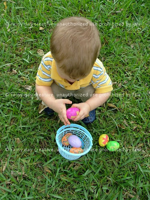
Anyways, baby Ben will be up from his nap pretty soon here. Better go! I will update later with some super cute photos I took at the Easter egg hunt this morning. Until then!


